- Details
- Written by Jeff Krol
- Category: TSL QB Power Rankings
- Published: 05 October 2023
- Created: 05 October 2023
- Hits: 436
Welcome back to the TSL Quarterback Power Rankings!
Why is your team's QB ranked so low? Let's find out!
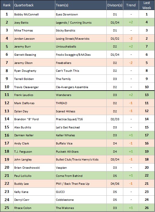
#1 Bobby McConnell - Eyes Downtown
Last Week: Did Not Play
No game for the TSL's top dog, but he WAS spotted at the fields this week scouting the competition.
#2 Joey Batts - Legends / Cunning Stunts
Last Week: Beat Sticky Bandits 52-26, beat Frodo Swaggins 61-24 (Legends), beat Travis Henry's Kids 51-32, beat Father Baker 56-36 (Stunts)
There was a time when we were considering a huge drop in the Power Rankings for Joey when it seemed like he was no longer the starting QB of his D1 team. Not anymore. Joey put up 51, 52, 56 and 61 points in his four games on Saturday. If you're looking for a path to climbing the Power Rankings, there's the blueprint: join competitive teams, and score a shitload of points.
#3 Mike Thomas - Sticky Bandits
Last Week: Lost to Legends 52-26, beat Losing Streak 33-14
The Sticky Bandits ended their four game losing streak (against Losing Streak!), and then promptly started a new one against Legends. The struggle this week was determining which of Mike or Jordan would be ranked higher. Jordan's D1 team has scored 40 more points and has a better record... but we gave the edge to Mike for going 2-0 against Losing Streak head to head.
#4 Jordan Lawson - Losing Streak / Mavericks
Last Week: Beat Frodo Swaggins 52-18, lost to Sticky Bandits 33-14 (Losing Streak), beat Practice Squad 58-26 (Mavericks)
See above. Maybe Jordan should be #3. Maybe not. Power Ranking is tough! Two 50+ point games on Saturday helped his case. The 14 point loss did not. If Losing Streak can beat Legends next week, that'll be enough to earn them a first round bye and almost certainly a move up in the Power Rankings.
#5 Jeremy Burr - Untouchaballs
Last Week: Beat Practice Squad 39-0, beat Freeballers 37-14
Can't Touch This were the early Cinderella story in D2. Then it was Freeballers. But if we're being honest with ourselves... wasn't this ALWAYS Untouchaballs division to lose? They might not finish with the #1 seed. But they'll finish with Burr and Helm and Greg and Mel... and that's enough to go all the way.
#6 Garrett Beesing - Frodo Swaggins / BAADies
Last Week: Lost to Legends 61-24, lost to Losing Streak 52-18 (Frodo)
Well, they didn't go 0-9 this season, so that's something. But Frodo looked every bit the odd man out in D1 last week with two massive losses to Legends and Losing Streak. They have two close games against the Sticky Bandits, who they play again this weekend, but it's hard to imagine them beating anyone ELSE in the playoffs this season.
#7 Jeremy "Hogan" Olson - Freeballers
Last Week: Lost to Untouchaballs 37-14
The bubble has burst on the recent Freeballers domination. Oh, they're still a great team, and they'll still make a great playoff run, but for a minute there it seemed like they were basically... untouchable (awful pun. who writes this stuff?). They're still the best point differential in D2, and have to at least be in the conversation for favorites to win that division.
#8 Ryan Dougherty - Can't Touch This
Last Week: Did Not Play
No games for Can't Touch This on Saturday. Reminder: it's been over a month now since they beat a team not named "Scared Hitless".
#9 Terrell Bolden - The Family
Last Week: Did Not Play
No game for The Family this week as Let's Get Reccked forfeits. We might forfeit too if we had to go against this machine!
#10 Travis Cleavenger - Cle-Avengers Assemble
Last Week: Beat THREAD 37-28
Since an opening week 0-2 start, Cle-Avengers have been trading wins and losses week to week. Neither hot nor cold, they're kind of stuck in neutral in the D2 race at the moment.
#11 Frank Laudico - Wanderers
Last Week: Beat Bullet Club 43-34, beat 716 70-6
Wanderers needed just one more point to beat 716 by a score of 71-6. What a wasted opportunity. Last week we were writing about how these guys were in last place in D3. They don't feel like a "last place" team anymore after two huge wins on Saturday.
#12 Mark Dalfonso - THREAD
Last Week: Lost to Cle-Avengers Assemble 37-28
The mediocrity of THREAD continued on Saturday as they dropped a close game to another mid-level D2 team. Is all this going to be irrelevant in the playoffs when they just keep bombing it to Andy Smith over and over?
#13 Dylan Day - Scared Hitless
Last Week: Did Not Play
No games for Scared Hitless this week.
#14 Brandon "B" Ford - Practice Squad / 716
Last Week: Lost to Untouchaballs 39-0, lost to Mavericks 58-26
Practice Squad locked up the 8th seed in D2 this week by losing both games of a doubleheader (even if Scared Hitless loses both of their last two games this Saturday, they own the tiebreaker over Practice Squad). That means B and team will face either Can't Touch This, Untouchaballs or Freeballers in the first round of the playoffs. They crushed a very different looking Freeballers team in last Spring's playoffs and played a close one against Can't Touch This earlier this season, so we assume they're rooting for anyone BUT Untouchaballs in that first round.
#15 Alex Buchlis - Let's Get Reccked
Last Week: Did Not Play
No games for Let's Get Reccked this week. Well they HAD one, and had to forfeit. Should that count against a QB in the Power Rankings? It didn't.
#16 Damien Keller - Keller Whales
Last Week: Beat Vaspian 45-30, lost to The Malones 53-30
Keller Whales are in 2nd place in their division with only a +2 point differential on the whole season. Man, D3 is really the most exciting division we have this season. We give up trying to predict game outcomes here.
#17 Andy Clark - Buffalo Vice
Last Week: Lost to Puckett All-Stars 32-24
Is Buffalo Vice vs Puckett All-Stars the best rivalry in D4? We think it is. Puckett took the latest chapter in their ongoing feud this week... and somehow Andy sits one spot above T.J. in the Power Rankings? How is that fair?
#18 T.J. Ferguson - Puckett All-Stars
Last Week: Beat Buffalo Vice 32-24, beat TMA 30-7
Puckett gets one quality win this week and one... well, less quality win. We've seen Puckett sort of coast in the regular season many times in the past just to amp it up in time for the playoffs. Is that their plan again this season?
#19 John Langley - Bullet Club / Travis Henry's Kids
Last Week: Lost to Wanderers 43-34 (Bullet Club), lost to Cunning Stunts 51-32, lost to ILF 31-20 (Travis Henry's Kids)
Three games, three losses for Langley this week. Which team would you feel more comfortable betting $100 on to win their respective championship in a few weeks? We should ask John that question.
#20 Brian Orzechowski - Vaspian
Last Week: Lost to Keller Whales 45-30
Vaspian dropped their second game in a row on Saturday to fall to 4-3 on the season. Don't they usually play great defense every year? Giving up 45 points is not great defense!
#21 Paul LoVullo - Come From Behind
Last Week: Beat Not So Sticky 28-17
Paul did what Paul does on Saturday and blasted away at a bad Not So Sticky team to finish Come From Behind's regular season at 6-3, which is CURRENTLY good enough for first place in D5. The Creekers can pass them with a win this Saturday, but no matter what seed CFB get, we expect they'll be favorites in that first round.
#22 Buddy Lee - Passing While Intoxicated / Back That Pass Up
Last Week: Beat TMA 50-16 (PWI), lost to Sausage McMuffins 29-8, lost to Mighty Drunks 25-21 (BTPU)
It seems strangely easy to beat TMA these days. Didn't those guys used to be awesome? While PWI is in fine shape for the playoffs, we're surprised BTPU is sitting in last place in D6. Isn't Buddy's veteran leadership enough to at least go .500?
#23 Kelly Kane - GUCCI
Last Week: Did Not Play
The GUCCI regular season is over - their only job now is to not collapse in the first round of playoffs... like they did last season.
#24 Darryl Carr - Cobblestone
Last Week: Lost to Spinelli's Plumbing 40-34
Cobblestone appears to be a lock for the 7th seed in D5 this season. We say it every week, but if Darryl's whole squad will all show up at the same time...
#25 Rhace Colon - The Malones
Last Week: Beat Keller Whales 53-30
Full disclosure: this guy would be ranked MUCH higher, if we knew anything about him. Who ARE the Malones? Who is Rhace? We're not even 100% sure he's the QB of this team. But they have a winning record in D3 this session and the third highest scoring team in the entire TSL (41.4 PPG). We should have Ranked this guy weeks ago.
Fancy Statistics Section
Here's a concept below that we did last season, and although not one person complimented us for it, we felt like it was worth recycling!
Some teams are carried to success by their great offenses (gender teams, typically) and others are carried by great defenses (Vaspian, historically), so we wanted to explore a more in-depth view to see how balanced each team is on both sides of the ball. To start with, we ranked all teams in the League on both offensive points per game and defensive points per game allowed from best to worst (the best is #1, the worst is #46). Then we subtracted each team's offensive rank from its defensive rank to see how big the difference was, and to what side of the ball (if any) each team skewed. Sound complicated? It's probably easier just to show you:
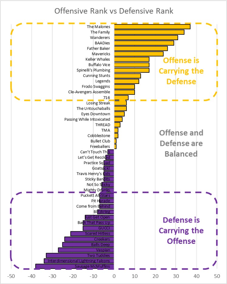
What does this graph even mean, why did we pick weird colors, and why aren't the bars even labeled?? All good questions (we admit, this is a weird one) but hear us out:
If you're on the top of the above chart in that orange color, it means your offensive rank is better than your defensive rank. For example, The Malones are the 3rd best offense in the League and the 40th best defense, so their combined score is +37. Sausage McMuffins on the other end of the spectrum is the 39th best offense in the League and the absolute best defense, so their combined score is -38 (shown in purple). These two teams represent the biggest extremes in the League right now, and everyone else falls somewhere in between. Anyone in orange leans towards offensive strengths, anyone in purple leans towards defensive strengths (those dashed boxes on the chart are just there to call out the biggest discrepancies where one rank exceeds the other by a lot in one direction).
So why did we pick orange and purple as the colors? We usually use green and red for our graphics, but green typically implies "good" and red typically implies "bad", and this graph isn't about "good or bad" -- it's just about which side of the ball each team seems to be strongest. The best example of the point we're trying to make is right in the middle of the graph, where you'll see TMA and Freeballers are virtually tied at -2 and -1 respectively (almost perfectly balanced, SLIGHT lean towards offense as their stronger side). On the surface they could not be more different teams: TMA are 0-8 (offensive rank: 42nd, defensive rank: 44th) and Freeballers are 5-2 (offensive rank: 5th, defensive rank: 6th). But both teams are about equally balanced in terms of their offense vs their defense... it just so happens that Freeballers are great on both sides, and TMA are NOT great on both sides. That's why we didn't label each bar on the graph - the +1 itself is kind of meaningless when you're describing either TMA or Freeballers -- the important thing is where your team falls on the graph relative to the OTHER teams shown.
Why do we like this graph? Well, it helps you point fingers if you're trying to blame someone on your team for your failures, AND it helps to give credit to someone on your team if you're having success! In other words, if your team is deep in the orange category above, MAYBE consider laying off your QB next time he makes a bad throw, because your offense has been carrying your team all season. Or if you're deep in the purple, it probably IS your quarterback's fault you're not doing better, so feel free to bench him and try someone else at the position.
That's it for the TSL Power Rankings this week! As we said above, we don't currently have our own email address anymore, so if you have any thoughts about QB rankings, or you want to make sure we know who's throwing for your team, please feel free to contact our good friend This email address is being protected from spambots. You need JavaScript enabled to view it.
What's YOUR ranking?